My Role
Schedulr is a mobile-based application designed to help students manage their time more effectively. Our app integrates cloud-based scheduling and time management features, enabling students to prioritize commitments, track important deadlines, and schedule personalized work sessions to optimize their workflow.
This case study was completed over the course of four months, and formed part of my coursework at the University of Toronto's Faculty of Information. Utilizing a design thinking approach, myself and three other team members were able to develop a marketable, user-centred mobile solution.
Client
Schedulr - goal
management app
for students
UX / UI Design
User Research
Usability Testing
Prototyping & Wireframing
Data Analysis
University of Toronto
CASE STUDY


1) Empathize
We conducted primary and secondary research, utilizing a mix of quantitative and qualitative methods to understand our users.
2) Define + Ideate
We defined our persona, identified their needs, and drafted key ideas to move forward with.
3) Prototype + Test
We developed low, medium, and high fidelity prototypes, evaluating throughout each iteration.
Our process
STEP 01
Research
Competitor analysis
To gain a better understanding of the landscape, we conducted a competitive analysis on four of the most popular time management apps on the market, and found that while each provided a variety of time management tools to users, there wasn't an app that specifically targeted students with the goal of helping them balance their busy life and academic schedules.
Secondary research
To better understand the problem-space, we conducted secondary research on the effects of effective and ineffective time management amongst students. During this process, we referenced 3 major studies and 16 notable journal articles that focused on time management and planning amongst university students in North America.
Survey and interviews
With the goal of understanding how current students go about managing their time, planning their schedules, and balancing academic and social commitments, we surveyed 69 students and interviewed 8 representative users. Our goal was to identify possible correlations between students' current time management strategies and their level of satisfaction with academic performance and overall wellbeing.
STEP 01
Emerging themes
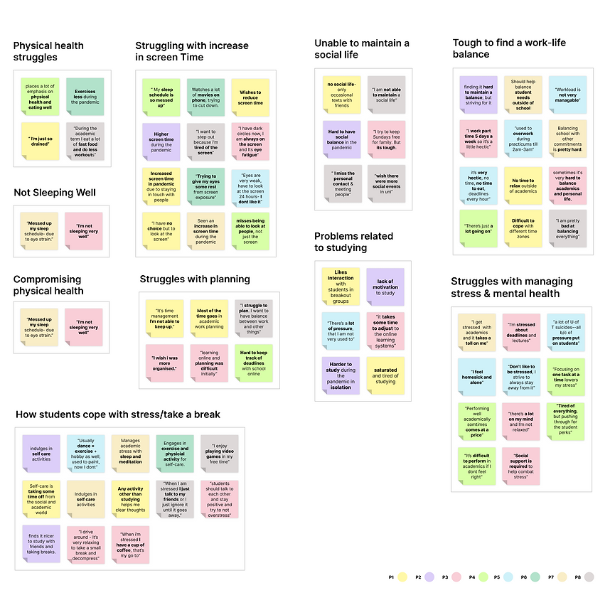
STEP 01
Key findings


STEP 02
Define
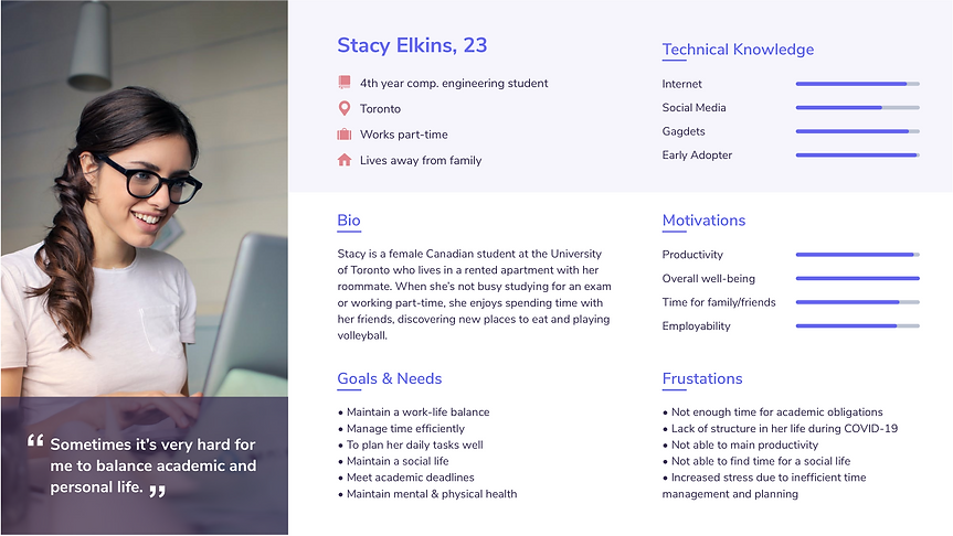
Defining the user persona
We began the ideation process by defining our user persona, Stacy. Like the students we surveyed in the research phase, Stacy needs a way to plan her academic deadlines so she can be on top of her tasks, a way to lay out her commitments so she can prioritize, and a way to measure the different aspects of her life so she can maintain a balance.
STEP 02
Ideate
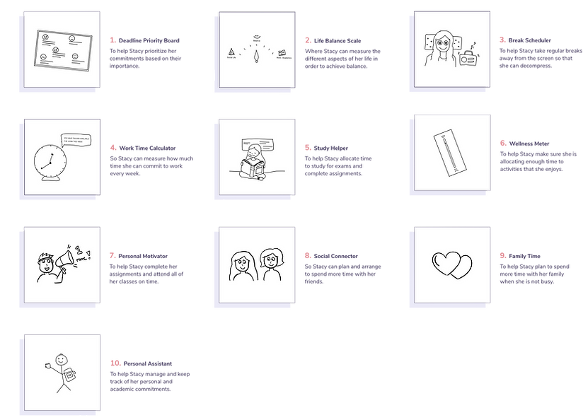
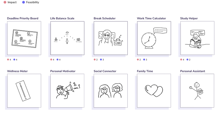
Our big ideas
After defining our persona's needs and identifying the main pain-points in their user journey, we got together and came up with 10 big ideas. During this process, we centred our ideas around the key problems and areas of opportunity that we found in the previous stages.
STEP 02
Prioritize
Voting on our ideas
After defining our big ideas, we voted based on impact and feasibility. This process helped us identify which ideas we’d like to focus on and move forward with for our project.
STEP 03
Prototype
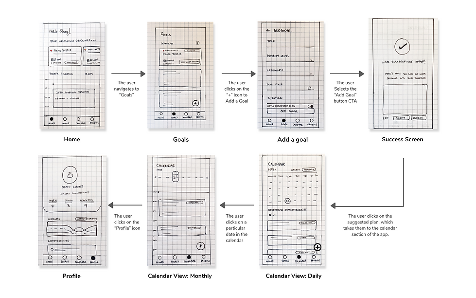
Low fidelity wireframes
After narrowing down our big ideas, we created our low fidelity prototype to evaluate our ideas. The goal here was to address Stacy's needs while eliminating instances of pain-points that were identified throughout the user journey.
STEP 03
Formative testing
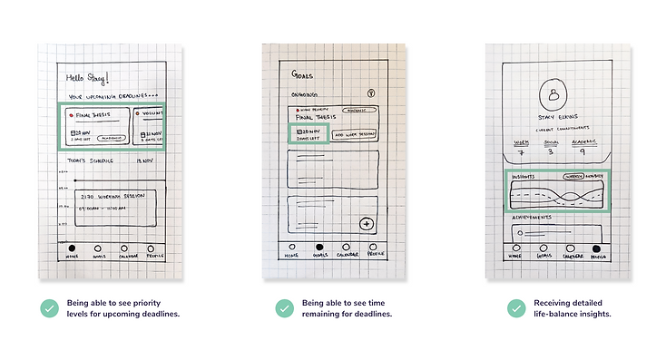
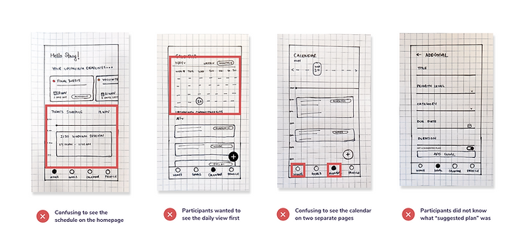
Guerilla testing
After creating our initial designs, we recruited four representative users and asked them to complete four user tasks using our low fidelity prototype. The goal of this process was to understand what users liked about our app and identify any pain-points they faced while going through the prototype.
STEP 03
Reflecting
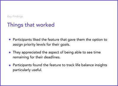
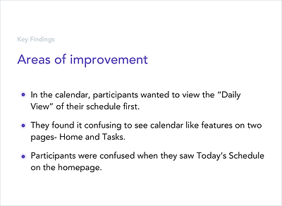
Key findings
Following the initial testing process, we analyzed our users' responses and identified the major aspects that users liked and didn't like about our app.
STEP 03
Iterate
Mid-fi prototype
We iterated on our initial designs to address the main pain-points and opportunities identified in our observations and created medium fidelity designs to reflect these changes.


STEP 03
Summative testing
Final evaluation
Using our mid-fi prototypes, we conducted one final round of observations to evaluate our design changes and make improvements before creating our high fidelity prototypes. Through this process, we found that participants wanted to see a more detailed breakdown of their life balance insights and more distinction between the home and goals pages.


STEP 03
High fidelity designs
Individual design changes
I made changes based on our users' feedback to create an improved, high fidelity version of the app that featured more white space and distinction between separate elements, larger icons, and clearer text. To this design, I applied the Gestalt Principles, colour theory, and made use of grids to ensure consistency across pages.


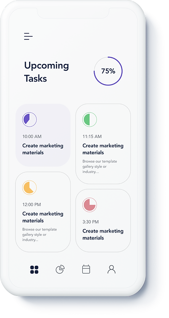
FINAL PRODUCT
High fidelity prototype
Task Prioritization
Prioritize tasks based on importance and urgency.
Life-Balance Insights
Be aware of time spent on social, work, and academic tasks.
Curated Work Sessions
Schedule curated work sessions based on personal goals and availability.